Slider Controller Plugin
slider_controller.xml
by Eric Chen - eric2022czc@gmail.com
Description
 This is a quick plugin for creating GUI panels.
- With simple configuration, you can quickly create slider controllers.
- This plugin applies to the numeric attributes of all tags.Such as layer, hotspot, views, etc.
- When the slider control is loaded, the property values of the target object are automatically synchronized.
The older version used in the examples does not support the use of multiple property lists. After purchase will send the latest version, future upgrade version free.
Download
Buy Slider Controller plugin - 19 €
(Krpano version 1.19 pr2 min)
Syntax / XML Usage Example
Simple include syntax
<include url="%root%/plugins/slider_controller_config.xml"/>
Settings
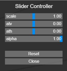
<slider_settings
	align="righttop"
	x="0"
	y="0"
	items_width="220"
	items_height="24"
	padding_x="20"
	padding_y="20"
	bg_color="0x000000"
	bg_alpha="0.8"
	slider_color="0x008ef5"
	slider_alpha="1.0"
	line_color="0xaaaaaa"
	line_alpha="0.5"
	text_css="color:#ffffff;font-size:16px;"
	title_css="color:#ffffff;font-size:20px;text-align:center;"
	reset_button="true"
	close_button="true"
	bgclick_close="true"
	title="slider controller"
/>
-
align
(optionally)
- Alignment / origin-point position of the layer / plugin element on the screen. Possible values: lefttop, left, leftbottom, top, center, bottom, righttop, right, rightbottom
- default=righttop
-
x/y
(optionally)
- Distance from the align point to the edge point.
- default=0
-
items_width/items_height
(optionally)
- Destination size of the items
- default:items_width=220,items_height=24
-
padding_xy
(optionally)
- Padding / space in pixels around the items.
- default=20
-
bg_color
(optionally)
- The background color
- default=0x000000
-
bg_alpha
(optionally)
- The background alpha
- default=0.8
-
slider_color
(optionally)
- The slider color
- default=0x008ef5
-
slider_alpha
(optionally)
- The slider alpha
- default=1.0
-
line_color
(optionally)
- The item line color
- default=0xaaaaaa
-
line_alpha
(optionally)
- The item line alpha
- default=0.5
-
text_css
(optionally)
- The item text css
- default="color:#ffffff;font-size:16px;"
-
title_css
(optionally)
- The title css
- default="color:#ffffff;font-size:20px;text-align:center;"
-
reset_button
(optionally)
- Whether the reset button is displayed.
- default=true
-
close_button
(optionally)
- Whether the close button is displayed.
- default=true
-
bgclick_close
(optionally)
- Whether to close by clicking the background area.
- default=true
-
title
(optionally)
- Title text
- default="Slider Controller"
Property list configuration
<controller_groups name="group1"/>
	<controller_items name="item1" attribute="scale" title="scale" default="1.0" min="0.0" max="2.0" />
	<controller_items name="item2" attribute="ath" title="ath" default="0.0" min="-180.0" max="180.0" />
	...
</controller_groups>
-
controller_groups.name
- Group name, used to distinguish different attribute lists.
-
controller_items.name
- Itmes name, used to distinguish between different attribute items.
-
controller_items.attribute
- Property name.
-
controller_items.title
- The item text
-
controller_items.default
- Set the initial value, which will take effect when the reset button is clicked.
-
controller_items.min
- Set the minimum value of the value range.
-
controller_items.max
- Set the maximum value of the value range.
Plugin Actions
-
load_slider_controller(group,target);
- group:Matches controller_groups.name to load the corresponding property list.The first group is selected by default (controller_groups[0].name).
- target:Select the bound object. Can be any tag, such as hotspot[...],layer[...],view.The default value is caller.
-
Code example:
onclick="load_slider_controller(group1,hotsopt[na1]);"
onstart="load_slider_controller(group2,view);"
Hotspot example
|
|
Layer example
|
|
View example
|
|